English
 한국어
한국어 Español
 العربية
 dansk
dansk Ελλάδα
In two-piece swimwear, color does more than make a product visually distinctive. The position, proportion, and contrast of different colors can influence how customers perceive the silhouette, where they focus their attention, and how easily a design can be recognized as part of a brand's collection. A well-planned color-blocking strategy can make a familiar swimsuit look more structured without requiring a completely new pattern.
For swimwear brands, this makes color blocking more than a decorative technique. It can become part of the product-development strategy. When color placement is considered alongside panel construction, garment proportions, fabric characteristics, and production requirements, brands can create designs that are visually differentiated while remaining practical to manufacture and extend across multiple styles.
Color blocking is the deliberate combination of clearly separated color areas within a garment. Instead of relying on an all-over print or a single solid shade, designers use different color sections to create contrast and establish a visual hierarchy.
In two-piece swimwear, these color areas can appear across the top, bottom, waistband, side panels, straps, binding, or individual construction sections. The contrast can be subtle, such as two closely related neutrals, or more pronounced through complementary or high-contrast shades.
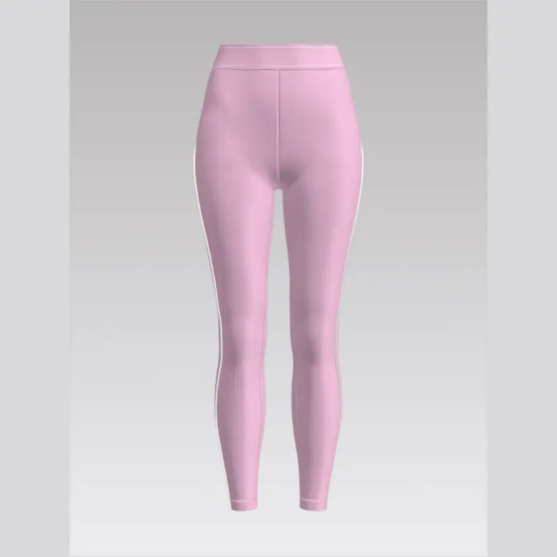
The important point is that the color boundaries become part of the design structure. A side panel can emphasize the vertical direction of a silhouette, while a contrasting waistband can visually separate the upper and lower sections of the garment.
This approach works particularly well with split swimwear because the top and bottom already function as separate components. Brands can coordinate the two pieces through shared colors while still allowing each component to have its own visual emphasis.
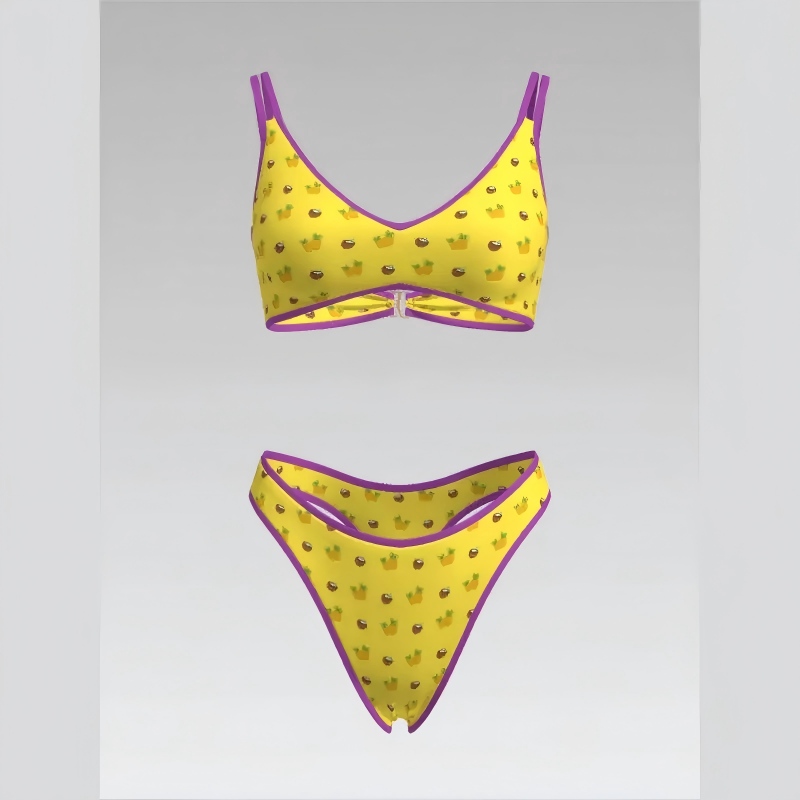
Color selection alone does not determine the final appearance. Where a color is placed can be equally important.
| Color Placement | Potential Visual Effect | Development Consideration |
|---|---|---|
| Side panels | Creates stronger vertical definition | Panel width should remain visually balanced across sizes |
| Center panels | Creates a clear focal area | Works best when surrounding details remain relatively controlled |
| Waistbands | Emphasizes the transition between sections | Should coordinate with the bottom silhouette |
| Contrasting top and bottom | Creates a stronger two-piece identity | Consider whether the pieces should be interchangeable |
| Straps and trims | Adds smaller visual accents | Use selectively to prevent visual clutter |
Panel proportions also affect the result. A narrow contrast strip may function as a subtle accent, while a large contrasting section can become the dominant feature of the swimsuit.
For this reason, designers should review color blocking together with the actual pattern. A color arrangement that looks balanced in a flat sketch may appear very different once it follows curves, seams, gathers, or cutout areas.
Two-piece swimwear naturally creates several visual zones because the garment consists of an upper and lower component. This gives designers more opportunities to create contrast without making the product unnecessarily complicated.
For example, a neutral bottom can be combined with a stronger-colored top, while a shared trim color visually connects the two. Another approach is to reverse the color relationship between different sets, allowing the same palette to create several distinct combinations.
This modularity is particularly useful for brands planning broader collections. A single color system can support several silhouettes rather than requiring a completely new palette for every product.
A split bikini can therefore function as more than one individual SKU. When the top and bottom are designed as coordinated components, brands can create multiple combinations from a relatively controlled set of colors and patterns.
Outpace's current split-swimwear range includes different bikini constructions, including triangle, strapless, high-waisted, printed, cutout, and other combinations, giving brands multiple structural bases for applying different color strategies.
Commercial color selection should begin with the role each color is expected to play within the collection. A product line does not necessarily need a large number of colors to appear varied. A carefully structured palette can produce more combinations while keeping production relatively manageable.
A useful system can include three levels:
Core colors: dependable shades that can remain available across multiple seasons.
Accent colors: stronger shades used to create differentiation within selected styles.
Seasonal colors: trend-oriented options used for limited collections or campaign-driven launches.
This approach gives brands more flexibility when expanding a successful design. Instead of redesigning the entire swimsuit, a new accent color can create a fresh appearance while the underlying pattern remains unchanged.
However, digital color references should not be treated as the final production standard. Fabric surface, stretch, finish, dyeing conditions, and lighting can influence how a color appears. Physical lab dips or fabric samples are therefore important before bulk approval.
Yes. The human eye tends to follow strong color boundaries, meaning that color placement can influence how the overall silhouette is perceived.
Vertical color divisions can emphasize the length of a garment, while horizontal divisions can make the design appear more segmented. A contrasting waistband can draw attention to the waist area, while a darker side panel may visually separate the center section from the outer edges.
But these effects should not be treated as universal rules. The final result depends on the swimsuit's actual silhouette, fabric stretch, panel width, and size.
This is particularly important during pattern grading. A color block that looks proportionate on a sample size may become relatively wider or narrower as the pattern is increased or reduced. If the visual relationship between panels is important to the design, grading should therefore preserve more than just the basic garment measurements.
Color can become part of a brand's visual language when it is used consistently across different product categories. A recognizable combination of colors, panel proportions, or contrast details can make a collection easier to identify without relying on a large logo.
For example, a brand might establish a neutral base color and consistently introduce one stronger accent. That accent could appear on straps in one design, a side panel in another, and a waistband in a third.
For brands developing custom swimwear, this creates an opportunity to treat color as part of the brand system rather than as a one-off design decision. Customization can extend beyond logos, prints, and labels to include the visual relationships between different garment components.
The goal should be consistency without excessive repetition. If every product uses exactly the same color arrangement, the collection may begin to look formulaic. Reusing the same palette while changing the panel geometry or silhouette can create greater variety without losing brand recognition.
A color-blocked swimsuit may look relatively simple on a design board but can require additional production control. Every additional panel creates another cutting and sewing interface, which can increase the importance of alignment, seam accuracy, and fabric consistency.
Panel matching is especially important when the color boundary is intended to form a continuous line. Even a small shift can become visually obvious when two contrasting colors meet.
Stretch can introduce another challenge. Highly elastic swimwear fabric may behave differently during cutting and sewing, which means that the final panel relationship can change if tension is not controlled consistently during production.
Before bulk production, brands should review:
Color accuracy against the approved physical sample.
Panel dimensions after grading.
Alignment at major seams and joining points.
Color consistency between fabric lots.
Stretch behavior at panel boundaries.
Appearance after washing and repeated wear.
These checks become even more important when a color-blocking concept is intended to be reproduced across several silhouettes.
Color blocking and printed graphics produce different visual effects and require different development approaches.
Color blocking depends on separate color areas, which means the garment's construction often becomes part of the visual design. Printing can place detailed graphics, patterns, gradients, or branding across a continuous fabric surface without necessarily changing the underlying pattern.
Color blocking is therefore particularly useful when a brand wants a clean, structured, and modern appearance. Prints may be more appropriate when the objective is to communicate an artistic theme or more complex visual information.
The two techniques do not have to be mutually exclusive. A swimsuit can use solid color blocks as the main design structure while introducing a small printed element as an accent.
Yes. In fact, developing a color system rather than a single colorway can make a collection much easier to expand.
Consider a three-color system consisting of a primary color, a contrast color, and a small accent. The same relationship could be applied differently across triangle tops, bandeau designs, high-waisted bottoms, halter styles, and other silhouettes.
For one product, the primary color might dominate the top while the contrast color defines the bottom. Another design could reverse that relationship. A third could use the accent color primarily on straps or trim.
The result is a collection that looks coordinated without making every swimsuit identical. This is especially valuable for wholesale buyers because multiple products can share a recognizable visual identity while still offering meaningful design variation.
Size grading is often overlooked when brands evaluate color-blocking designs. A color arrangement should not be considered finished simply because it works on the development sample.
As the pattern changes between sizes, the dimensions of each panel change as well. If all panels are graded proportionally, the visual balance may remain relatively stable. If only the garment's circumference changes while certain decorative panels remain fixed, the color relationship may become distorted.
Brands should therefore inspect at least several representative sizes during development. The objective is not necessarily to make every color block mathematically identical, but to ensure that the overall visual hierarchy remains intentional.
This is also where physical sampling becomes useful. A digital rendering can demonstrate the intended color arrangement, but the actual fabric sample reveals how stretch, seam tension, body contours, and panel curvature affect the final appearance.
Before approving a color-blocked design, brands should evaluate the product from three perspectives: visual design, technical construction, and collection strategy.
From a visual perspective, ask whether the color boundaries strengthen the silhouette or simply add contrast. From a technical perspective, check whether the panel arrangement is practical to cut, sew, grade, and reproduce consistently. From a commercial perspective, consider whether the same palette can support additional styles or future seasonal variations.
Outpace's custom swimwear offering includes a broad range of patterns and 3D models, which can provide a useful foundation for developing variations while maintaining a consistent product structure. The company's swimwear pages also emphasize customization of designs and materials, making it possible to adapt the visual concept to different product requirements.
The strongest value of color blocking is not simply that it makes one swimsuit look different. It can help brands build a visual system that works across multiple products.
A carefully selected palette can be reused across different silhouettes, while changes in panel placement create enough variation to keep individual products distinctive. This reduces the need to reinvent the visual identity of every new style.
It can also make collection planning more deliberate. Instead of choosing colors independently for every SKU, brands can establish a core palette and decide where each color should appear according to the construction of the garment.
That approach creates a clearer relationship between design and production. The color palette supports brand recognition, the panel layout supports the silhouette, and the same design logic can be transferred to additional products.
Effective color blocking is ultimately about proportion and purpose. The strongest designs are not necessarily those with the most colors or the highest contrast. They are designs in which every color area has a clear role within the silhouette.
For brands, the development process should therefore move beyond choosing attractive color combinations. Designers need to consider panel geometry, size grading, fabric behavior, seam placement, production consistency, and how the design will work alongside other products in the collection.
When these factors are considered together, color blocking can become a practical design strategy rather than a purely decorative technique. It can give two-piece swimwear a stronger visual identity, create more product variations from a shared design system, and help brands develop collections that are distinctive without becoming unnecessarily complex to manufacture.